9 Main Benefits of Responsive Web Design for Businesses
9 Benefits of Responsive Web Design · Google prefers sites that are mobile-friendly, meaning they function perfectly on a mobile platform. Moreover, this improves your SEO
Imagine you're in a car, using your mobile device to read and browse a website, only to stumble upon a design that looks like it was built for a clunky old computer screen.
Small text, confused navigation, a layout, and an interface design that clearly indicates—this website is intended for a desktop only, isn’t it? In today's world, that kind of experience can make the difference between a loyal customer and a lost opportunity.
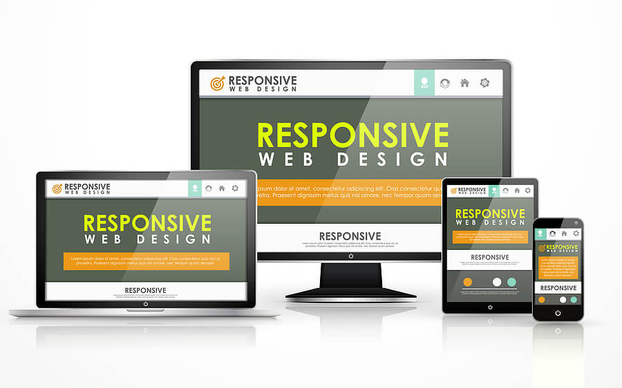
This is where responsive web design comes into play—the saver of the website world. Responsive web design is all about making a website that can easily adjust to the device and screen of the user, whether it is a large monitor or a small phone. It is like a chameleon that changes its appearance to perfectly blend into the surrounding environment.
Now, we will discuss how having a responsive website can increase your user experience as well as help with your conversion rate and even your SEO. By the end, you will be able to learn why the use of responsive web design is a necessity for any business to grow in this digital world.
Why Responsive Design Matters?
As of now, more than 60% of all the Web traffic is coming from mobile phones, and 92.3% of users browse the internet from their smart phones. This is a dramatic increase from a decade ago, and the trend is only going to rise further.
This kind of rapid increase in mobile visitors has shifted usage expectations significantly. It is now quite common for people to switch from one device to another, and it is essential that your website provide a seamless experience, whether one is using their mobile during rush hour or a tablet at home.
For a small business, a non-responsive website could be a disaster for customer retention and business growth. Suppose a customer is unable to zoom in on your products or is trying to fill out an annoying, misformatted contact form. They will easily become frustrated and immediately leave for your competitor, which has a responsive mobile site. The result? Lost sales, frustrated users, and a damaged brand reputation. In today's time, responsive web design is no longer a choice but a necessity for every business.
9 Powerful Benefits of Responsive Web Design
Let's discuss the major benefits of responsive web design for individuals and businesses one by one:
1. Better User Experience
In today’s digital age, first and foremost, every company wants and needs a convenient website. Responsive web design (RWD) is a technique that makes the website adapt to the screen size of the device it is being viewed on, whether it is a desktop computer or a smartphone. Imagine user-friendly navigation that adapts to any screen size without the need for frustrating zooming. Clear and readable fonts reduce eye strain on mobile devices. Additionally, optimized images load quickly and look stunning. It makes a website that may seem tailor made for each visitor, and thus it engages them and creates the right brand image.
2. Increased Sales from Mobile Users
In today’s mobile first world, capturing website traffic and converting it into paying customers or loyal subscribers is more paramount than before. Responsive web design is also important in this process, as it eliminates the obstacles to taking action on mobile devices.
Here's how this paves the way for increased mobile conversions:
- There are big and clear ‘call to action’ buttons for each of the devices to make an instant purchase, sign up, and so on.
- Bigger fields and fewer steps on mobile make it very easy to fill out the contact form.
- It has been seen that mobile conversion rates can be increased by as much as 74% when using responsive design, making your business sell more and grow.
3. Helps in Search Engine Ranking (SEO)
Google prefers sites that are mobile-friendly, meaning they function perfectly on a mobile platform. As you adopt responsiveness, you are also guaranteeing that your website offers the best experience, even to crawler bots. This mobile-first indexing means that Google ranks your mobile version before the desktop version. Also, it does not require having two URLs for the desktop and the mobile version, which can be confusing to search engines. What benefits does it provide?
- Positive ranking signal: Web design approaches such as website speed and clean coding are preferred by search engines, so your website may have an SEO advantage.
- Mobile-first indexing:Google search prioritizes mobile-friendly sites. Responsive design guarantees a perfect mobile version and helps to rank the website on mobile devices, which make up the majority of the online audience.
4. Less Maintenance (More Cost Savings)
Imagine having two different sites: one for the desktop and another for mobile. Isn't it a headache to manage both? Fortunately, responsive web design does not have this problem. It is beneficial because you only need one code to write for multiple devices. This is equivalent to huge cost savings. Software updates, bug fixes, and new content deployment occur only once, which means that you will not need to spend more time and money frequently for further updates. At the end, it keeps things streamlined and efficient.
5. Brand Consistency
It helps your brand stay consistent, no matter how visitors access it. Imagine the same colors, fonts, and messaging across desktops and phones. In this way, responsive design provides consumers with a smooth brand experience and helps to build trust and brand awareness.
Suppose a company, ABC, is a clothing store for young people with a bold, youthful vibe. Their responsive site brings the same feel regardless of the device. This consistency is beneficial for the growth of their brand, and it ensures that all customers experience the same style. When there are so many choices while browsing the internet, a strong brand image is a key to success. This can be achieved with a state-of-the-art responsive design that maintains all the essential elements of your brand identity.
6. Scalability and Future-proofing
Technology is a daily thing, more gadgets and screen sizes appear on the market. You need to consistently adapt your business to stay ahead of these changes and ensure your website remains accessible and user-friendly across all platforms. Responsive websites adapt to the size of the screen of the specific device used by the user to access the site, hence providing the user with an excellent experience. Investing in future-proof responsive design today saves you the cost of frequent redesigns every time a new gadget launches on the market.
7. Improved Website Analytics and Data Tracking
Nowadays, the time is gone when one had to use two different web analytics for desktop and mobile. A website's responsiveness enables you to have a bird's-eye view of the whole picture, with a summary at the top. It makes it easy to track user behavior and performance metrics across all devices in one place.
This global approach enables you to see how users engage with your site, which aspects need improvement, and, therefore, how you can improve the site. The reports from the search console can help determine the changes that should be made to the website and to future promotion plans in order for the company to address the audience’s needs as effectively as possible.
8. Boosts Social Media Connectivity
At core, responsive web design makes it very easy to share the content of a website on social media platforms. Think of properly formatted posts and captivating pictures, regardless of the kind of device a user uses. This seamless experience unlocks powerful social media benefits:
- Makes content shareable: No more gray background or text overlapping the picture! Responsive design makes your content visually appealing when it is shared on Facebook, Twitter, or any other social site.
- Increases brand awareness: Pretty looking and responsive content is shared more often, thus reaching other people and attracting new customers.
- Boosts engagement: If users share your content with a single click, it sparks conversations. It fosters a stronger connection with your brand.
9. Stand out among Competitors
The business world today has become extremely competitive, meaning that having a responsive website is no longer a ‘nice to have’, but a 'must have’ thing. It reflects your focus on usability and creativity and sets your business apart from your competitors, who still have old fashioned, non-responsive websites. Furthermore, the responsive design makes you forward-thinking company that focuses on up-to-now trends and visitors. It can even pave the way for the development of progressive web apps (PWAs).
Conclusion
It becomes clear from what we have discussed so far that investing in the development of a responsive website is essential. In today's time, a website is often the first interface with the customer in the mobile-first world. Responsive web design is an investment that produces results, it increases conversions, strengthens brand image, and future-proofs websites to handle any technological curveball.
Do you need help creating a website that keeps pace with today's mobile-first world? Our company is known for creating cutting-edge web designs and developing user-centric software solutions for modern businesses. Our team of web designers is ready to develop a powerful responsive design for your business and witness your online presence skyrocket. Get in touch with us for a free consultation. We'll help you craft a responsive website that your customers love and that drives real business results.
